Drone-Data-in-Agricultural-Research
Multispectral Data Visualization
Learning Objectives
- Start a new project in QGIS
- Add a raster layer from a file
- Color a raster by its values
- Know best practices for image display and communication
- Export a styled raster image
1. Setting up the Project
- Open QGIS
- Under the
Projecttab selectNewto create a new project (Ctrl + N) - Under the
Projecttab selectSave As...(Ctrl + Shift + S) to save the project. It is a good idea to regularly save projects while working on them (Ctrl + S).
2. Adding raster layers
A raster is data stored as individual pixels and displayed as an image. Most of the data from drone borne multispectral cameras, satellites, and other image acquisition technologies are stored as rasters. Images can have many extensions. The ones used in this example are .tif files.
- Add a raster layer by navigating to the
Data Source Managerby going toLayer»Add Layer»Add Raster Layer...(Ctrl + Shift + R).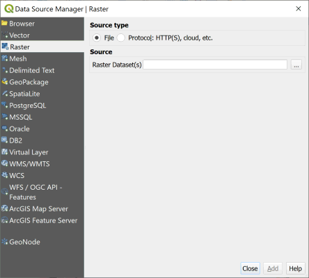
- Make sure the
Source typeradio button is selected to beFile. - Click the
...to navigate to the raster image Solano_2l20l20_index_ndre.tif in the downloaded Drone-Data-in_Agricultural-Research-data/example_data folder and open it. - Choose
Addto add the image to the project. - Close the
Data Source Managerafter the image has successfully been added to the project.
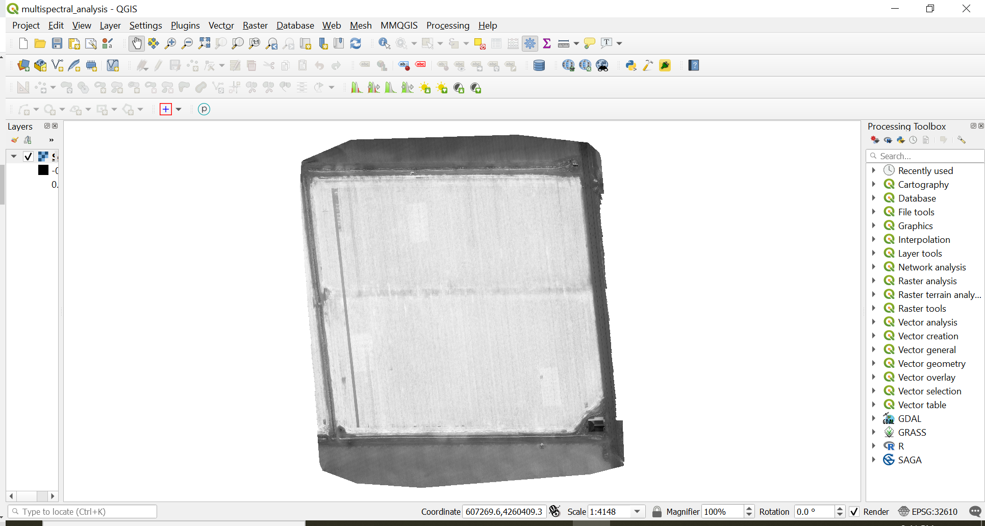
Check-in
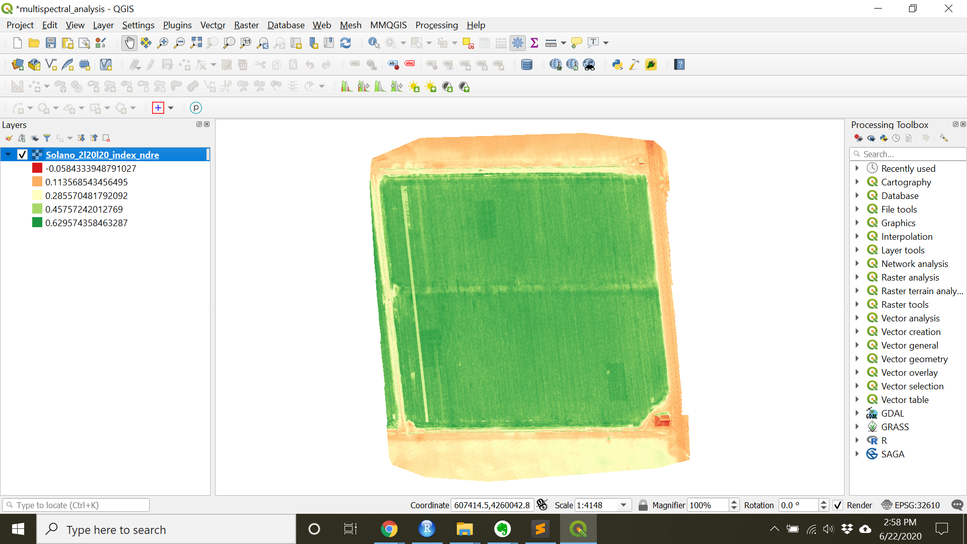
At this point the Solano_2l20l20_index_ndre.tif image should appear on the in both the
Layers Paneland in the project window. The image will be greyscale by default. See below.
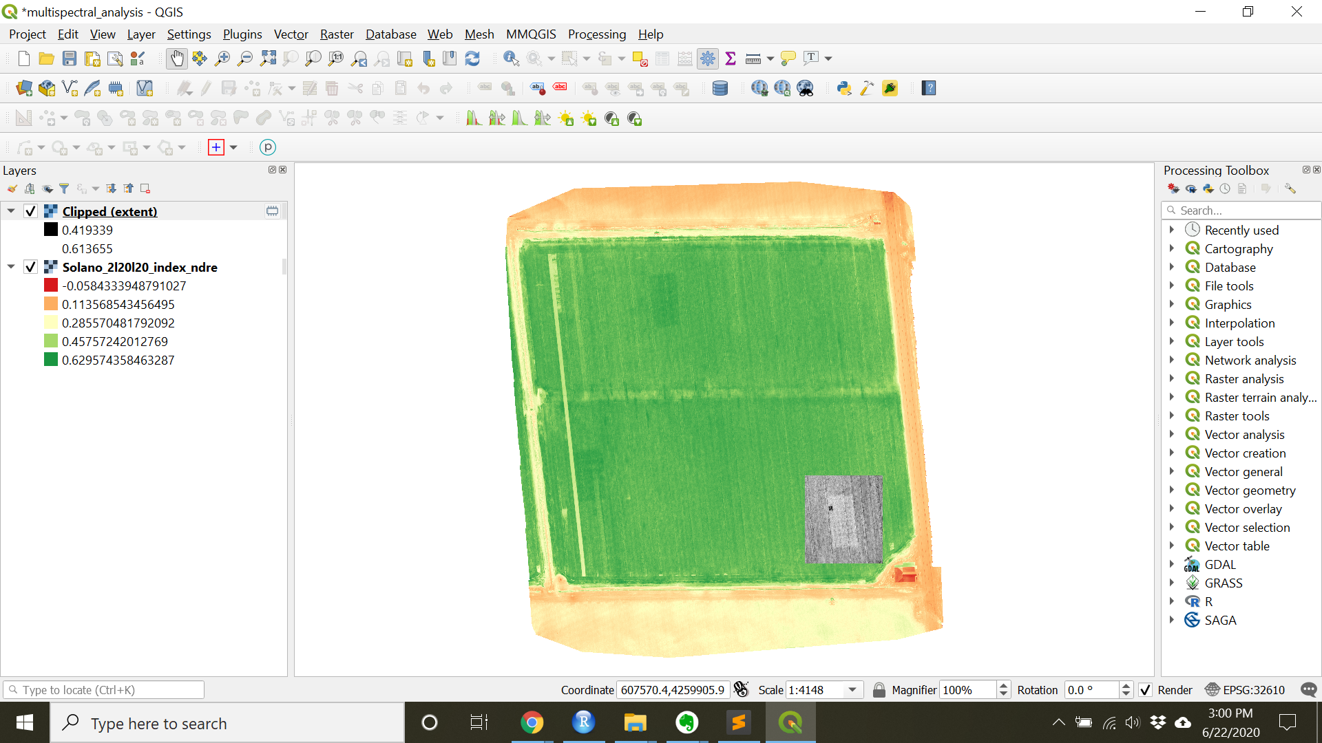
3. Coloring rasters by values
- Right click the Solano_2l20l20_index_ndre.tif layer in the
Layerspanel and chooseProperties.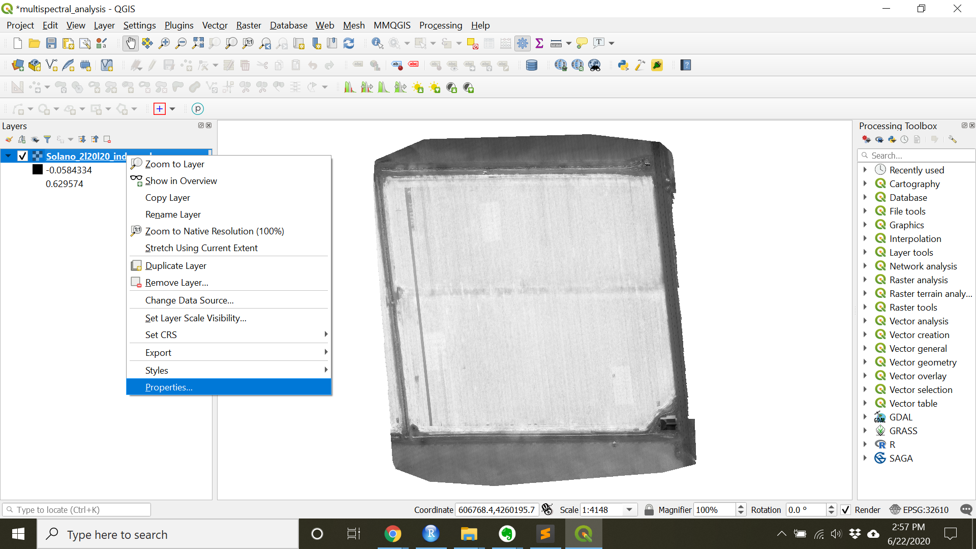
- In the
Symbologytab (should open by default), underRender typechooseSingleband pseudocolor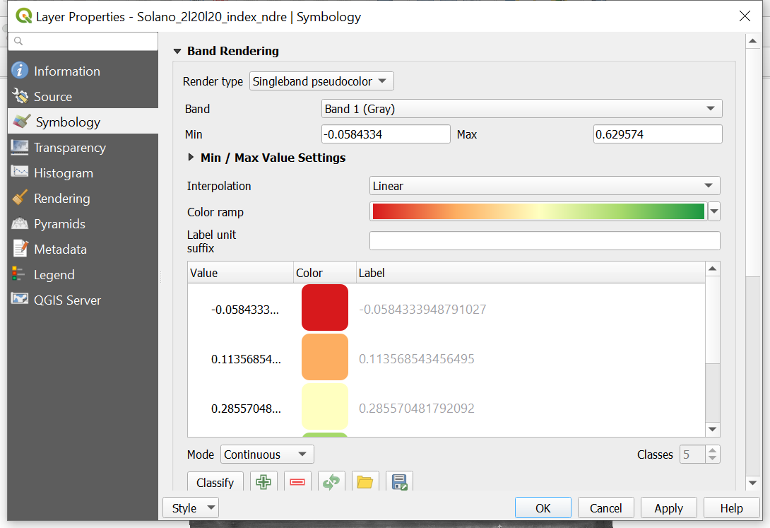
- Set the Min and Max to cover the extent of values that you would like to see in an end product legend. These values should be close to the values that the system recognizes are max and min.
- Set the
Interpolationdrop-down toLinear - The “RdYlGn” Color ramp is often used to show plant health since it is an easy assumption that red equates to unhealthy plants and green represents healthy plants.
- Make sure the
ModeisContinuoussince this data is continuous - there are no groups or factors. - Press
Applyto get a preview of your image. - Press
OKwhen you are done.
Check-in
At this point the raster should be colored (as below). Looking at this raster, what things should we improve on before finalizing it?
4. Image Display Best Practices
- Colors should be colorblind friendly.
- To preview a Project as would be seen by a person with colorblindness go to
View»Preview Mode - Here you can
Simulate Colorblindnessof multiple types as well as greyscale photocopies. - In general, choose colors that are high contrast for the features you wish to highlight.
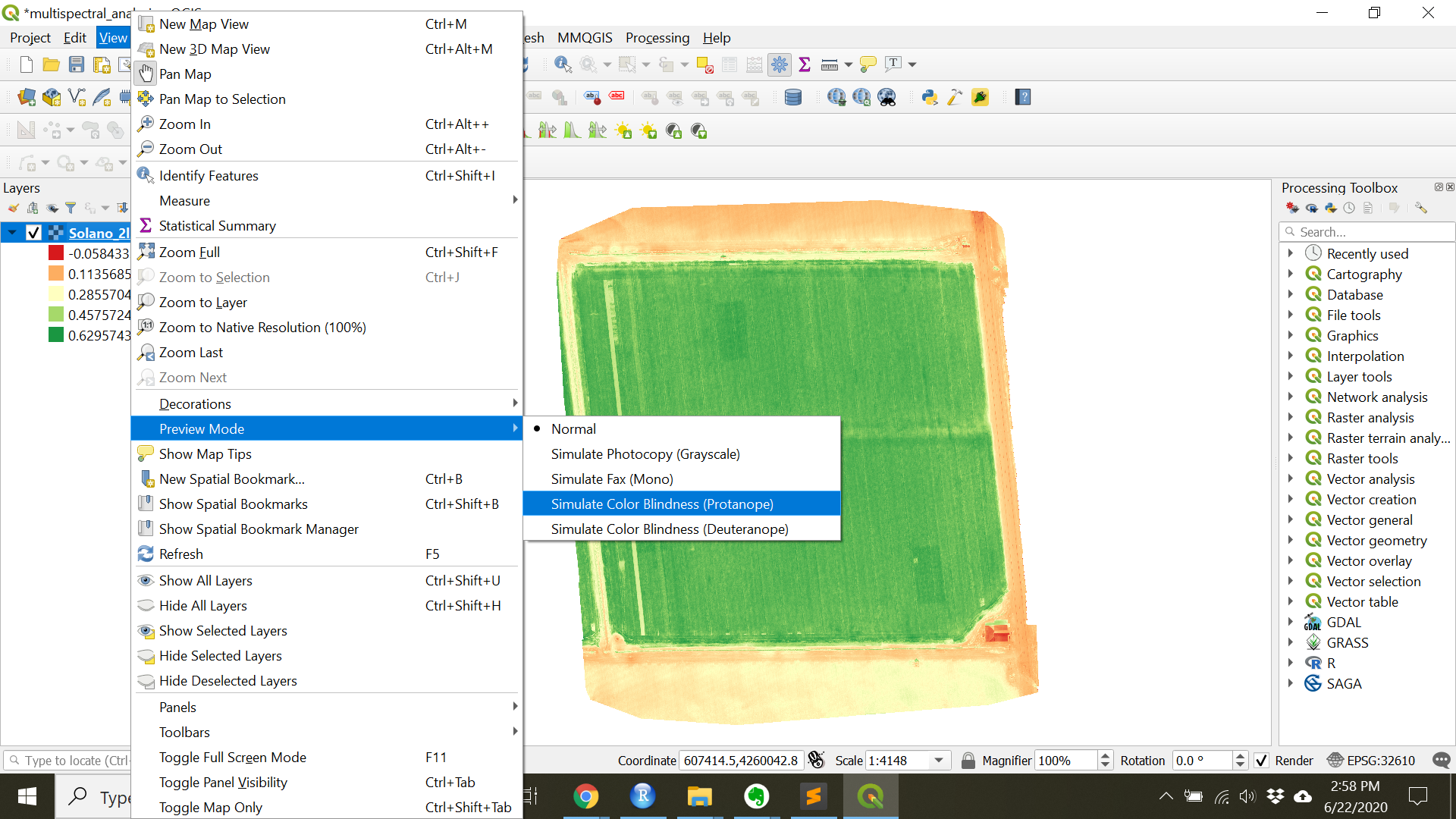
- To preview a Project as would be seen by a person with colorblindness go to
- Don’t include areas that are not of interest such as roads or other fields in the color scheme. This ofter causes there to be less contrast in colors in the area of interest and can be distracting to a viewer. Know what you are trying to show and maximize that in the image.
- One way to remove areas of interest is to clip to the area of interest.
- Clip to an area of interest by navigating to the
Clip Raster by Extenttool thoughRaster»Extraction»Clip Raster by Extent...(you can also navigate to theClip Raster by Extenttool through theProcessing Toolbox) - Choose a Clipping extent by clicking
...and choosingDraw on Canvas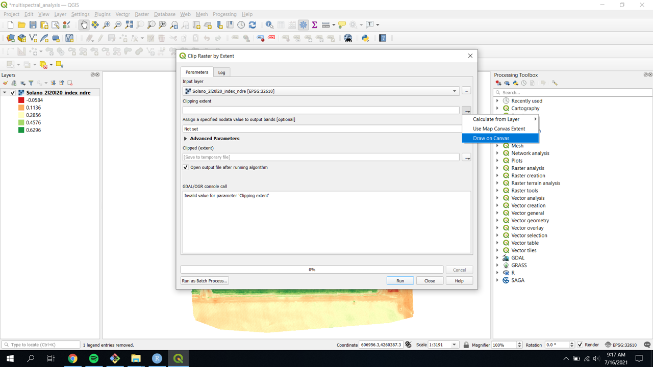
- This allow you to select an area of interest manually.
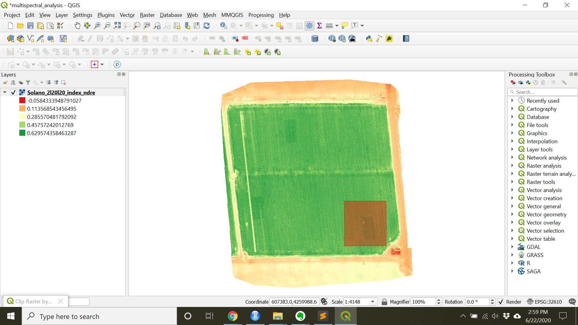
- Once this is done, you have the option to save the Clipped extent as well as the option to Open the output file after running algorithm. For this example, just make sure the Open the output file after running algorithm box is checked.
- Click
Run - Close the
Clip Raster by Extenttool after the algorithm has finished. - There should now be another layer in the Layers panels called Clipped (extent) and that layer should show up as a greyscale image in the project.
- Try coloring this layer just as the main layer was colored in the layer properties.
- Clip to an area of interest by navigating to the
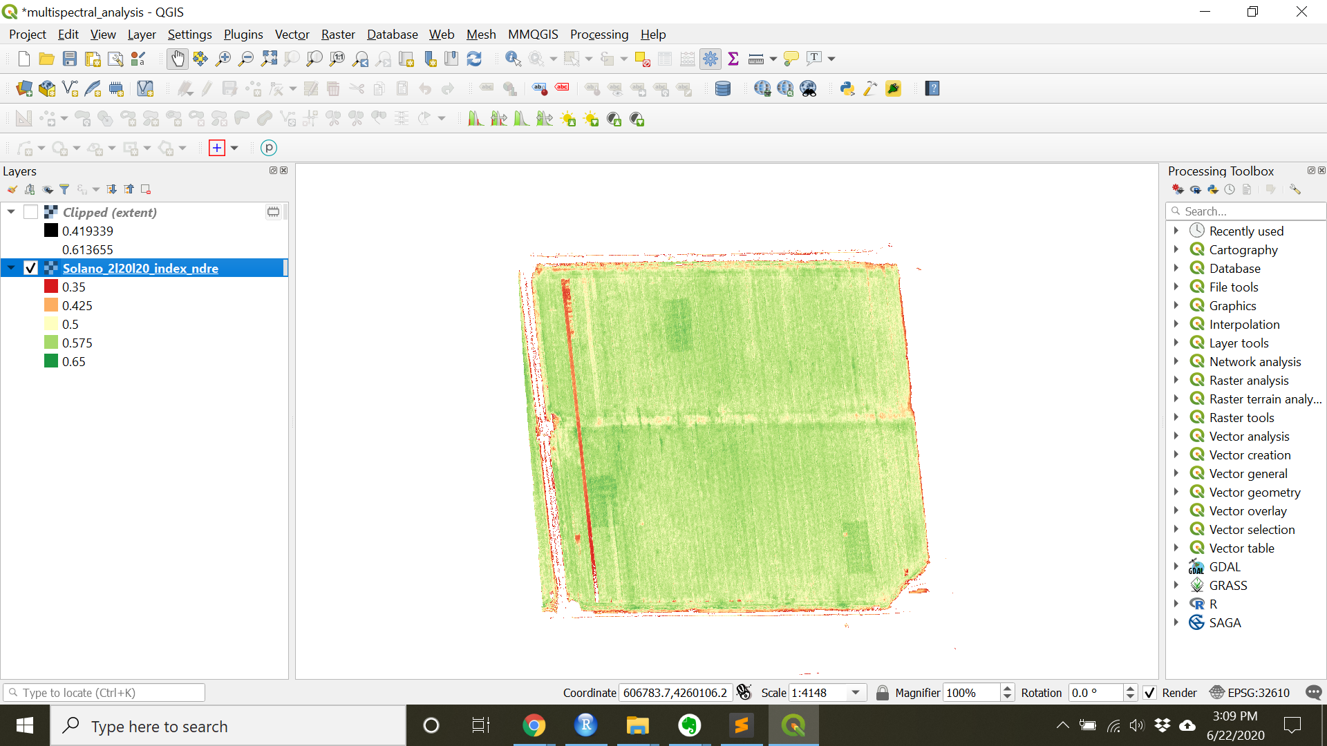
- Another way is to change the range of values and/or”Clip out of range values” in the layer properties.
- Open the “Solano_2l20l20_index_ndre” layer properties.
- Change the
MinandMaxto only include values in the area of interest. (Min= 0.35,Max= 0.65 for this image) - Press
Applyto preview. - To remove the areas out of the chosen range, scroll and check
Clip out of range values - Press
OK
- One way to remove areas of interest is to clip to the area of interest.
Check-in
At this point the raster should be colored (as below). Looking at this raster, what things should we improve on before finalizing it?
- Make the project into a map in order to include a legend
5. Exporting and saving outside for use outside of QGIS
- To export the styled image
- Navigate to
Project»Import/Export»Export Map to Image - Set parameters such as dpi depending on your end use (print vs screen)
- If you are not planning on using the geographic information from the styled image un-check
Append georeference information - Press Save to select the folder you want to save under or press
Copy to Clipboardto simply copy the image.
- Navigate to
- To export a map with a legend.
- Navigate to
Project»New Print Layout...(Ctrl + P) - Enter the title of the print layout in the pop-up window
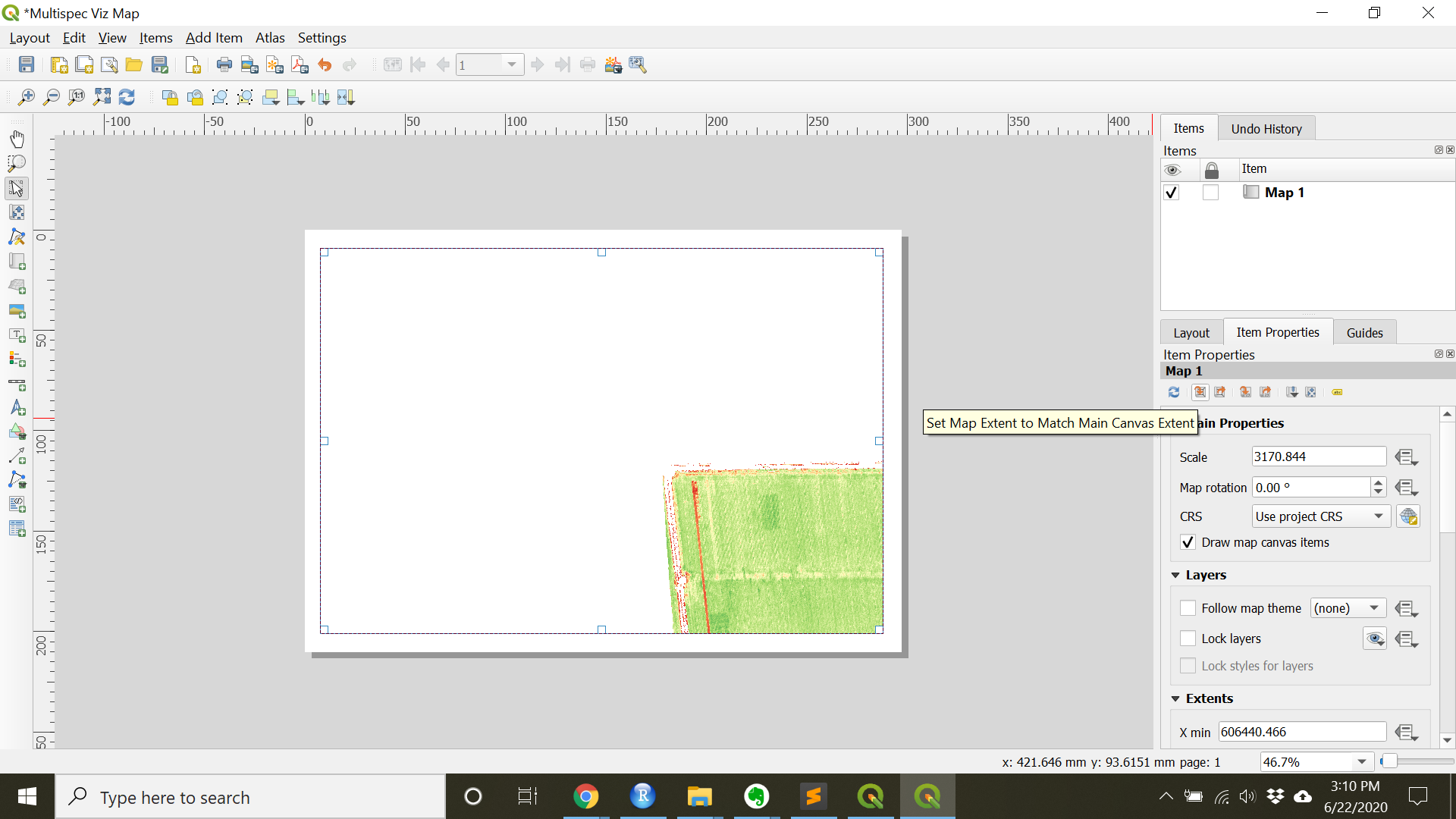
- To add a map navigate to
Add Item»Add Map
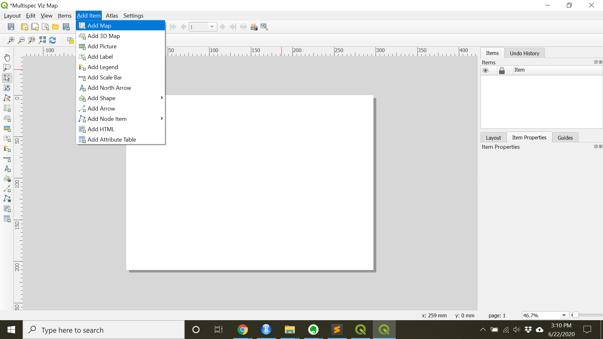
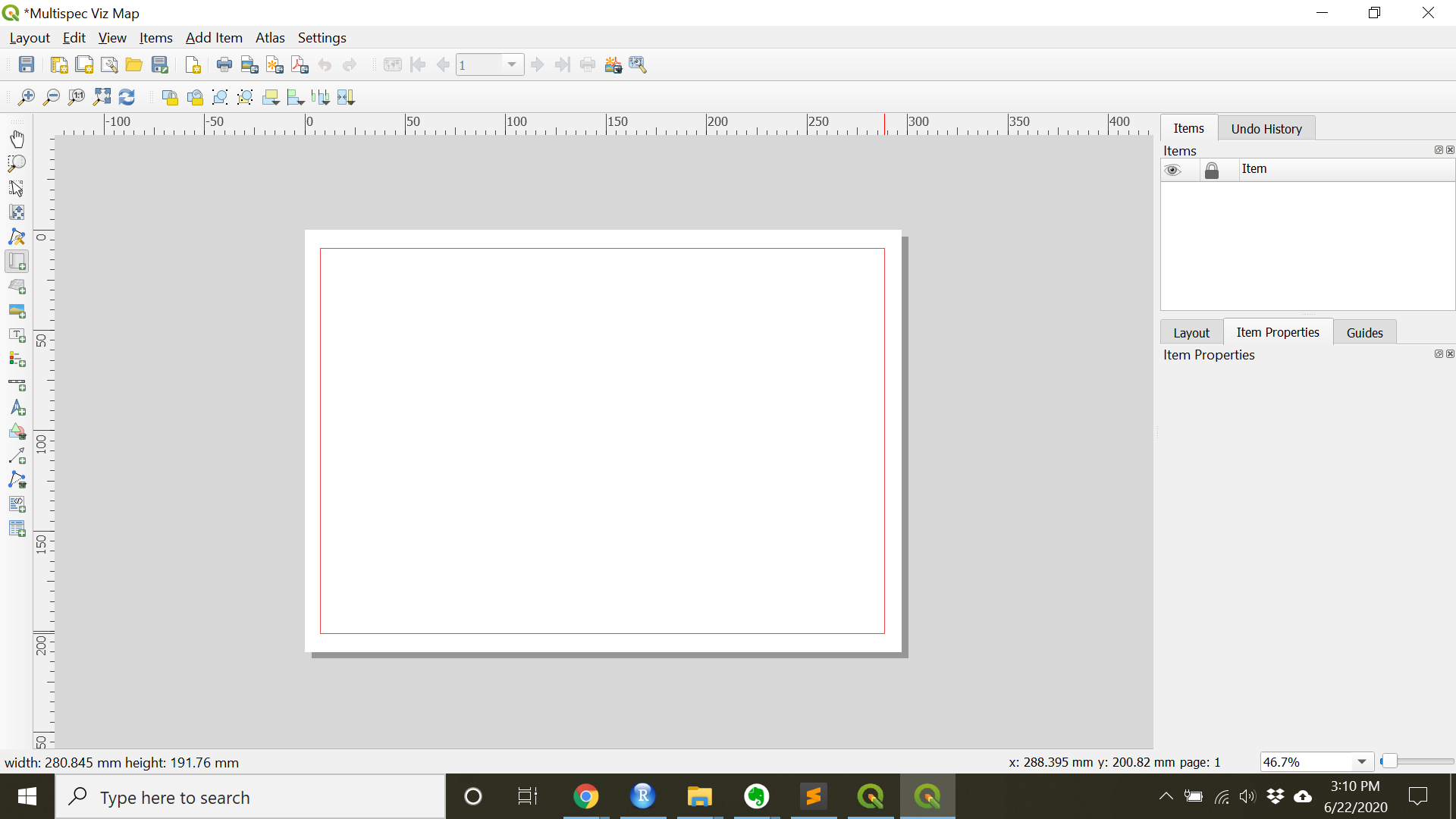
- Draw a box to contain the map
- To make sure the main canvas map is centered by right clicking the layer on the main canvas and choosing
Zoom to Layer. Then in the print compose under item properties pressSet Map Extent to Match Main Canvas Extent
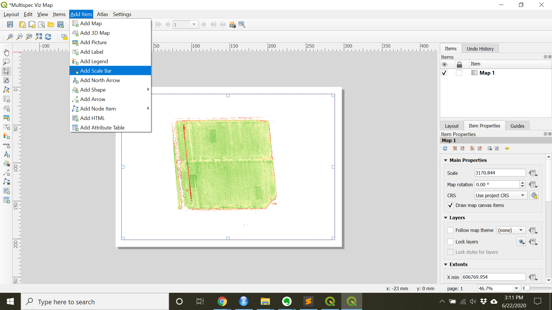
- Add additional items such as a scale bar, north arrow, legend, and/or title under the
Add Itemdrop down.
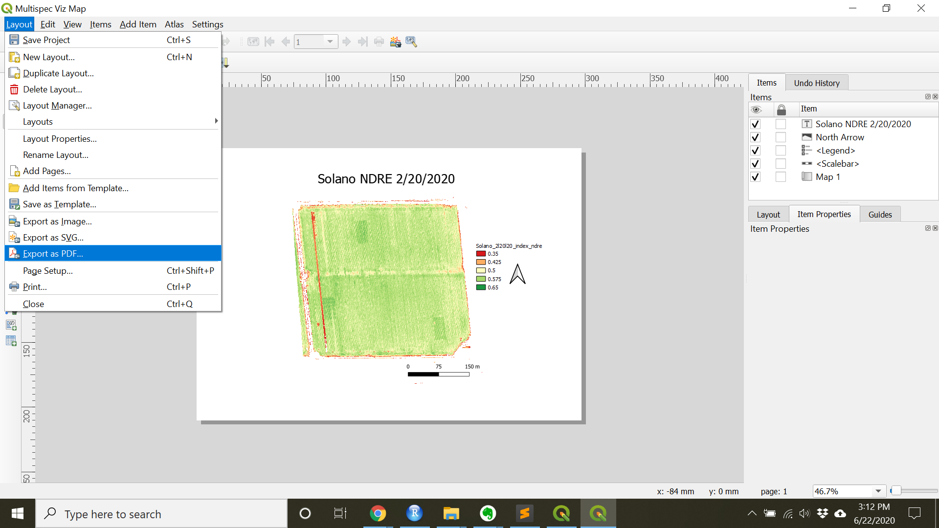
- When finished with the map, under
Layoutthe map can be exported as wither an imageExport as Image...or a PDFExport as PDF...
- For another, more in-depth tutorial on map making see: https://docs.qgis.org/3.16/en/docs/training_manual/forestry/results_map.html
- Navigate to
Now you are ready to move on to Multispectral Data Extraction (Low throughput)!